
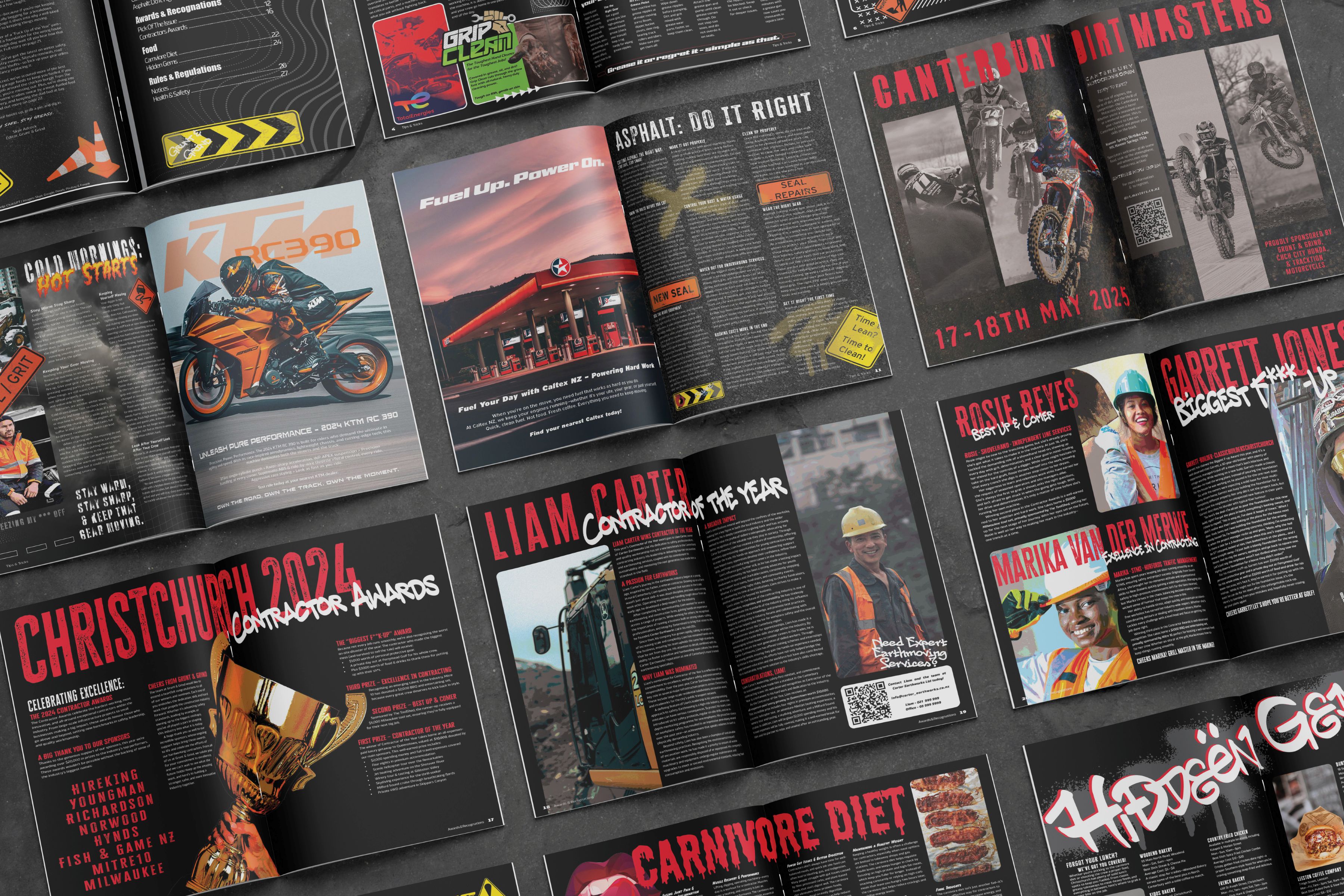
The Idea
Idea
I wanted to create a magazine that encourages people to get involved in the contracting
industry. Most contractor magazines are focused on buying and selling products, but I
wanted this one to be a playful and engaging take on the trade.
Target Audience
My target demographic is people aged 16+ who have an interest in, or work within, the
contracting industry. This could be a school leaver thinking about their next steps, or
an industry relic looking for a fresh take.
Style
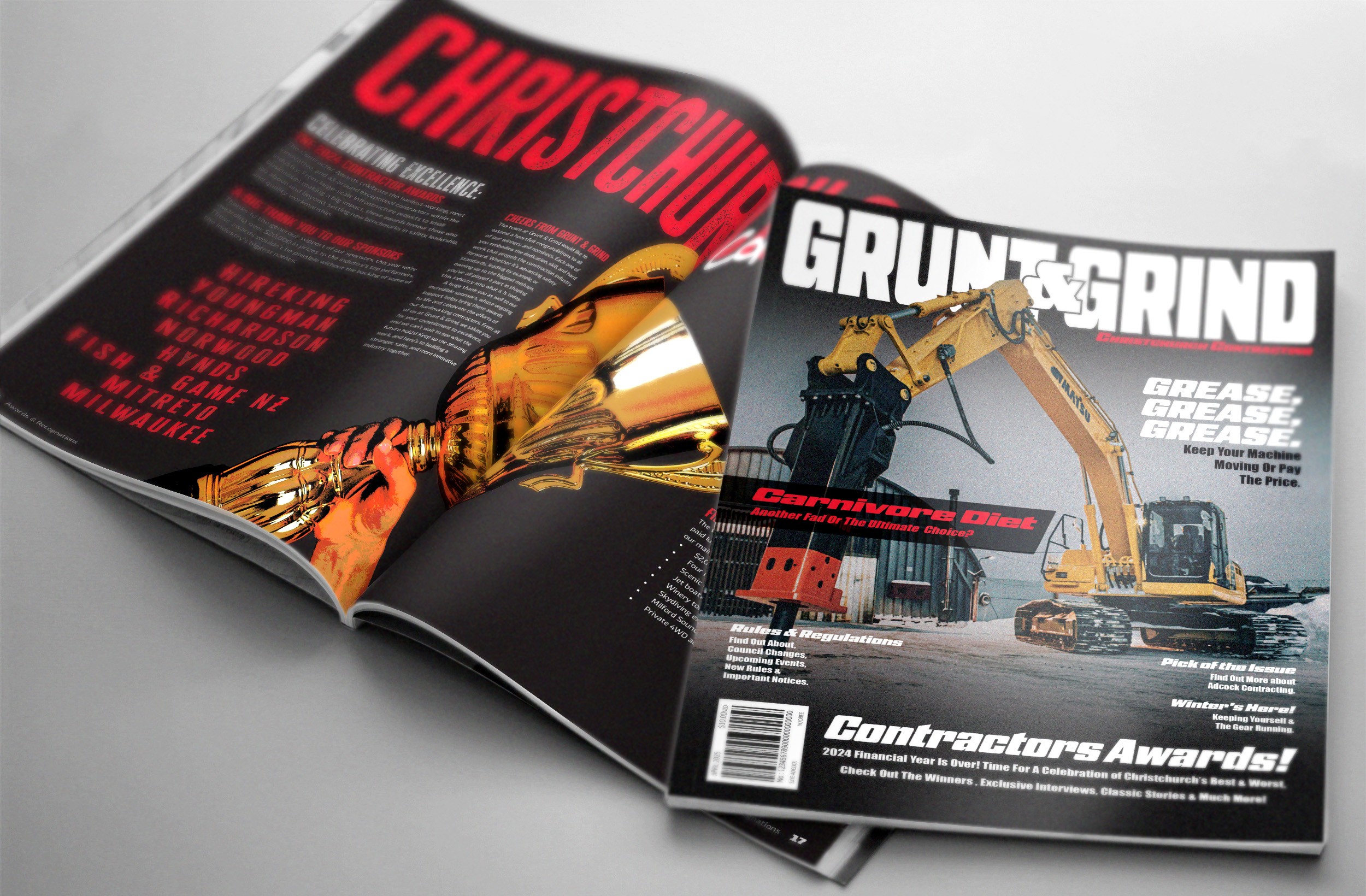
The style is brutalist—gritty, playful, messy, and a bit grungy.
Content
With eight years of contracting experience, I knew first-hand what my audience would
actually care about: helpful tips, ads for genuinely good products or hobbies, food,
notices, and chances to win some prizes.
Focus
Playful, dynamic & visually engaging layouts.